Vision Research and Innovation Co., Ltd.
Overview
Unity organization, comfort and health care, clear core
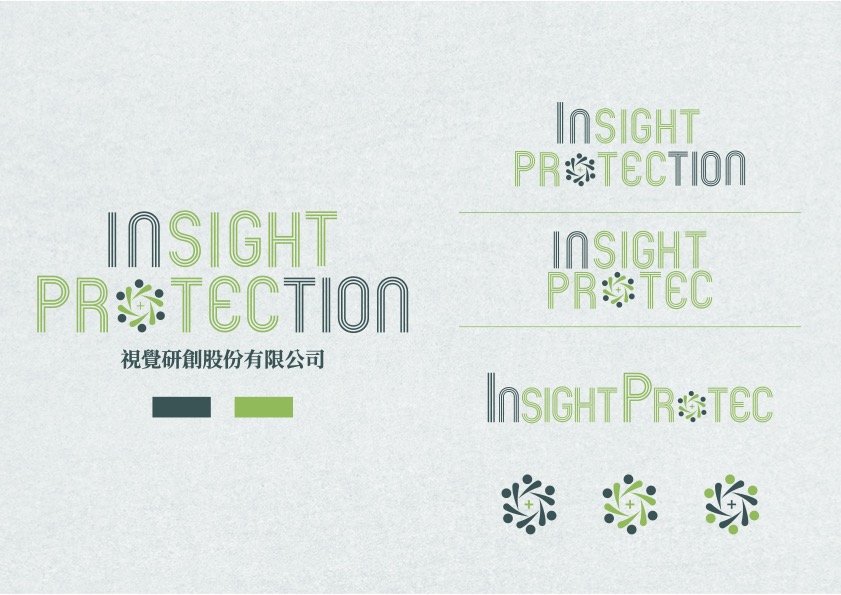
The logo design of "Insight Protection Co., Ltd." aims to convey the company's professionalism and stability in vision care and technological innovation. The use of green lines, green represents the common eye protection color in vision care, Symbolizing nature, comfort and health, this color choice is not only closely related to the theme of visual health, but also conveys the company’s core concept of paying attention to people’s eye health. Another design element of the logo is drawn with simple green lines. O not only symbolizes the shape of the eye, but also represents the unity and interconnectedness of the crowd, emphasizing the company's people-oriented service tenet in visual health care technology. In terms of fonts, it is recommended to use a simple and stable font design that complements the softness of the green lines. It presents a professional and stable visual impression, effectively conveys the company's technical expertise in the field of vision care, and shows its emphasis on user health and safety, creating a stable and trustworthy brand image.
- Branding
- Business Plan


