Overview
Bloom happiness and imprint positive energy in every corner
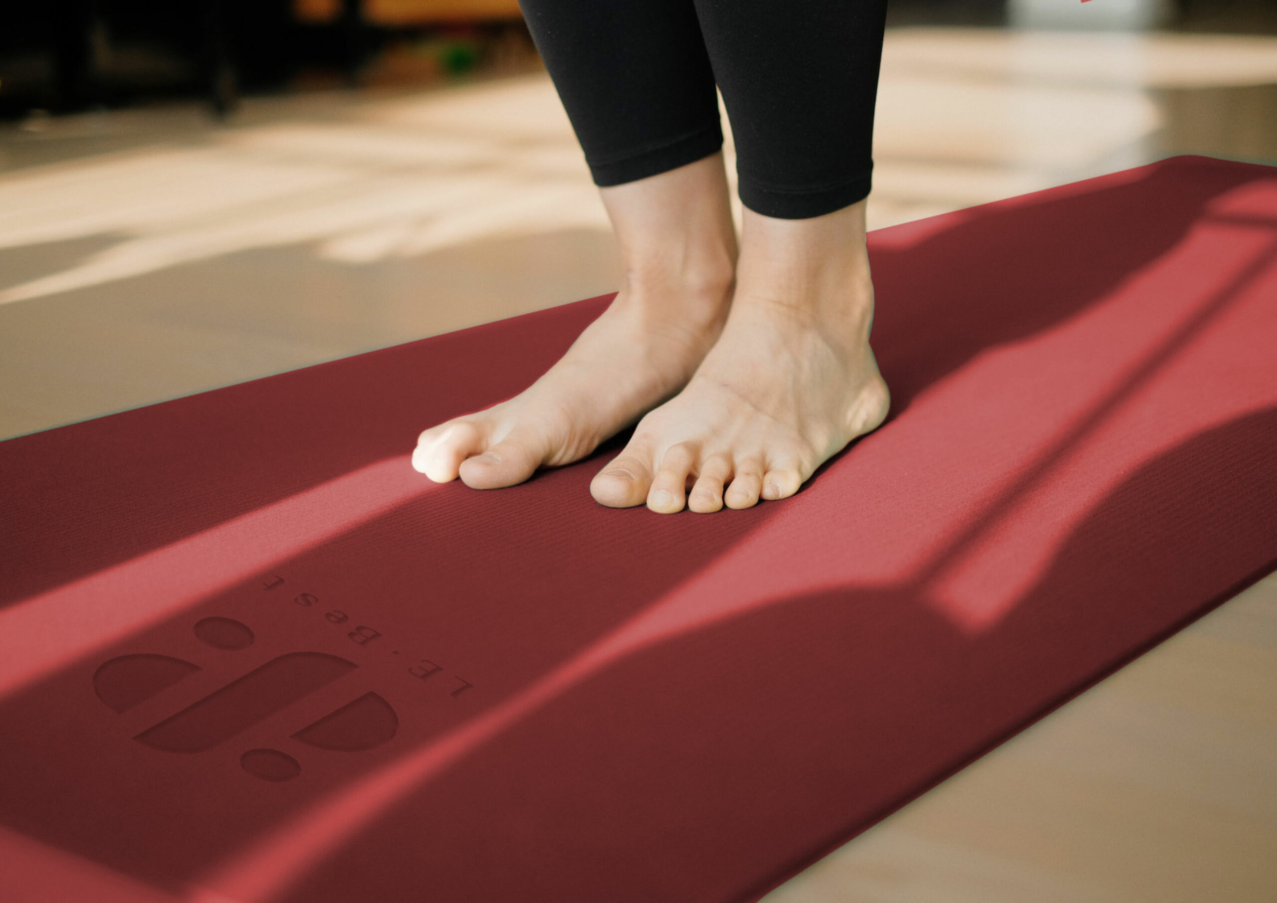
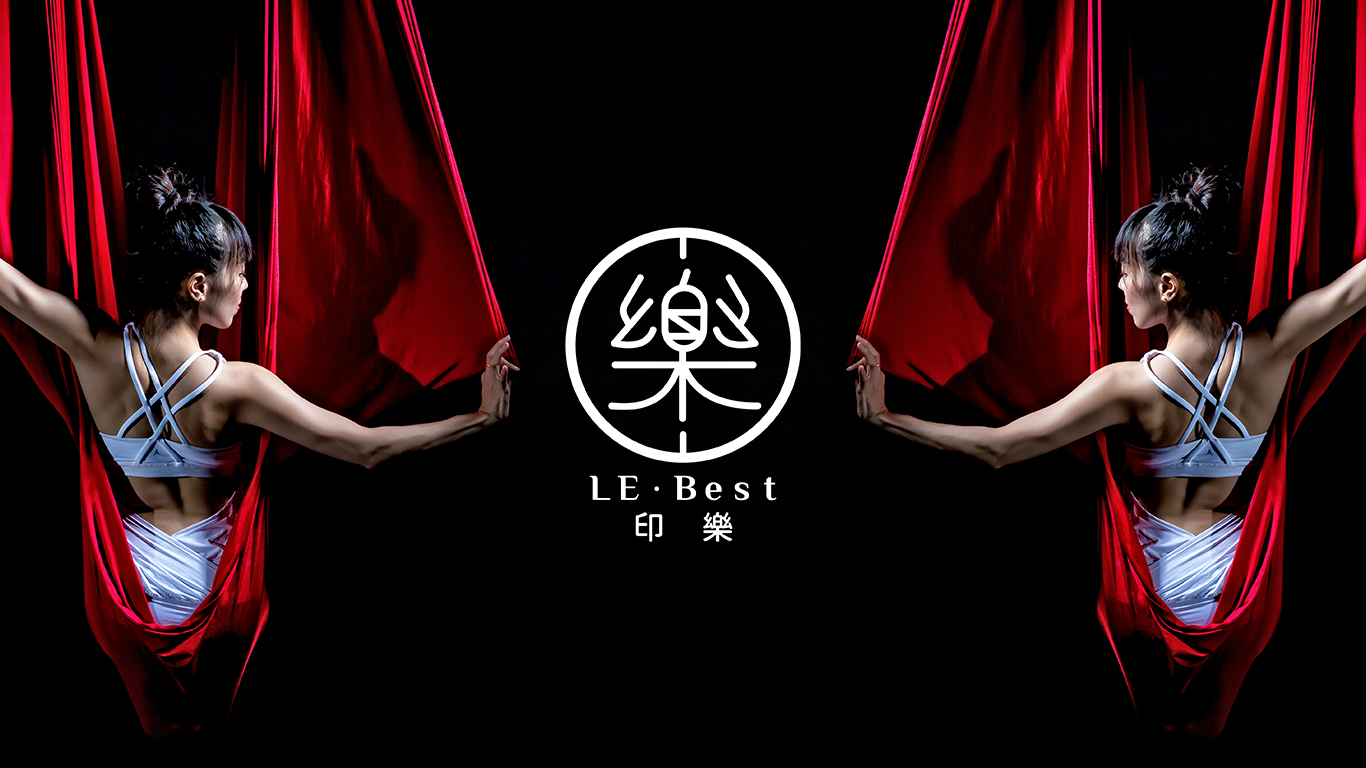
Just like the positive force symbolized by the brand name "Le", this vitality is integrated into our visual design. The smooth lines and soft fonts seem to be integrated with the style of yoga. At the same time, we also injected strength and tension to create a perfect balance between the inner and the visual, presenting the brand's dynamic and harmonious character.
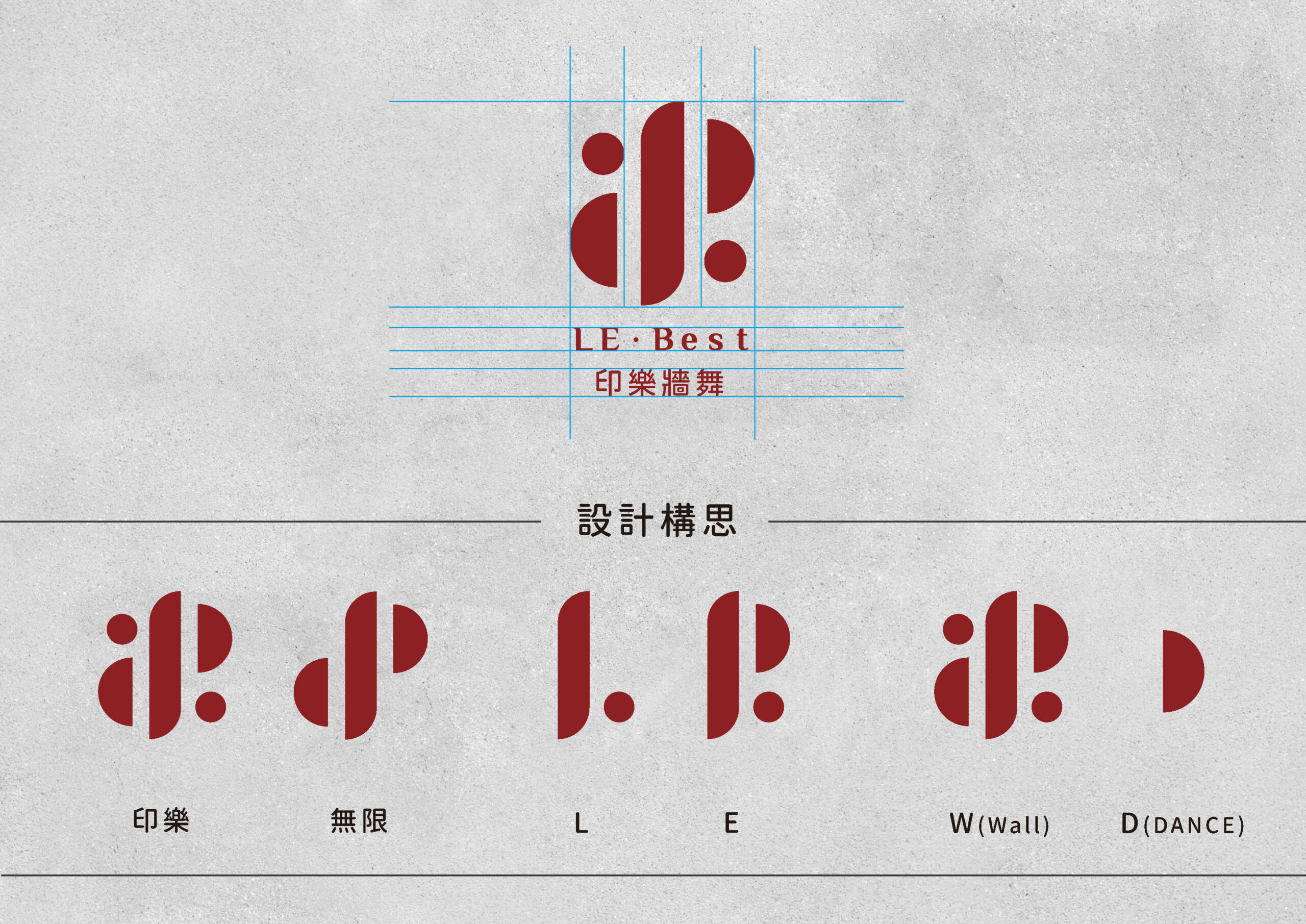
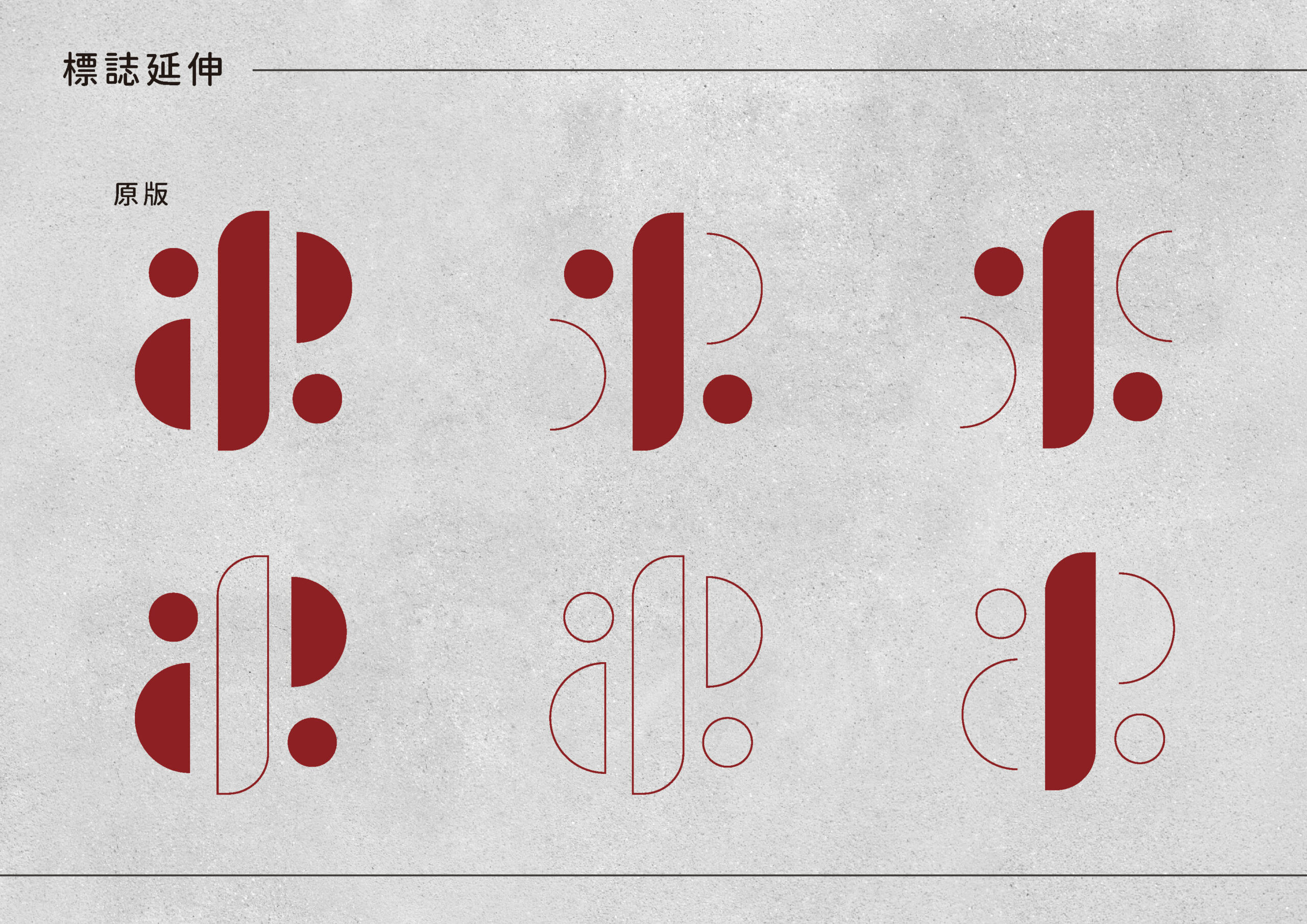
Qingcheng Design redesigned the visual system of the time-honored yoga brand "Yinle". We maintained the elements of the original logo design while making the overall presentation more concise and elegant.
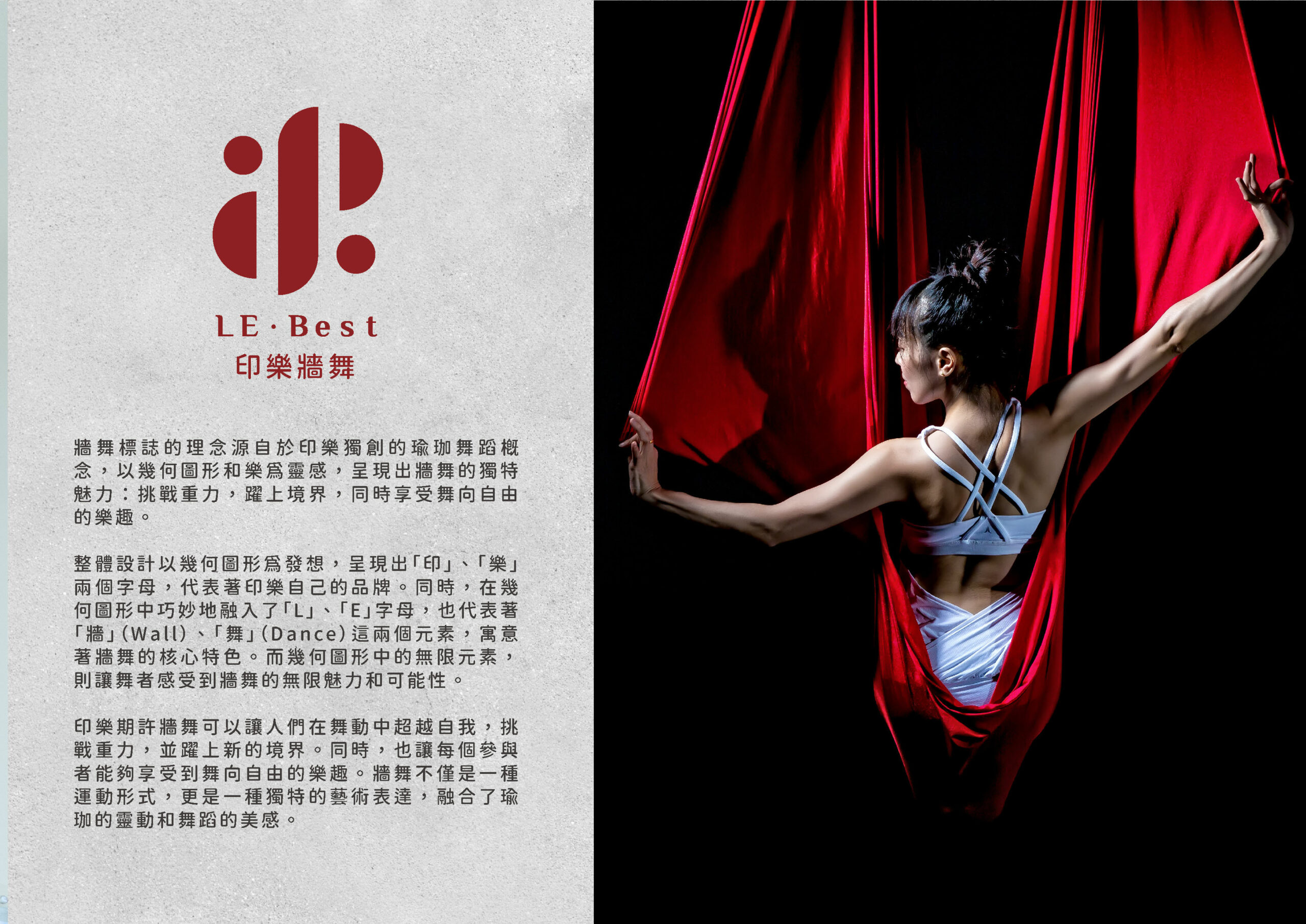
In addition, we incorporated the most unique element of Yinle, "wall dance", into the new visual system. We combined geometric elements with the movements of the wall dance, while retaining the elements of the Yinle logo to ensure that the two logos look the same. Consistent yet unique.
This redesign aims to highlight the vitality and inner harmony of the brand, as well as integrate the spirit and aesthetics of yoga into the visual image to make the brand more attractive and recognizable. In addition, a website and project fundraising were produced during the project cooperation to raise funds. The qualification was successfully met within seven days, creating a certain buzz for Yinle.

